
(Solved): WPC300-33872 Assignments: HOA-new-2...
WPC 300 : HOA-2 : Case - Medical Malpractice
AUG 2020 UPDATE is now ready see it here
WPC300-33872 Assignments: HOA-new-2
Case - Medical Malpractice:
Descriptive Statistics, Graphics, and
Exploratory Data Analysis
Assignment instruction:
You must install JMP pro on your computer before attempting this assignment. You must use the data file: MedicalMalpractice.JMP.
Read the case very carefully and answer the questions (fill in the blanks) when necessary. The questions are colored in "red". In addition, you must reproduce all the figures by following the instructions provided in the case.
Deliverable:
Create a word document and answer all the questions and attach the screen shot of all the figures in the case (Exhibit-1 to 11). The first page of your document must have your full name and student ID.
Analysis
We begin by looking at the key variable of interest, the amount of claim payment. Exhibit 1 displays a histogram and summary statistics for Amount.
Exhibit 1 Distribution of Amount
(Analyze > Distribution; Select Amount as Y, Columns, and click OK. For a horizontal layout select Stack under the top red
triangle.)
From Exhibit 1 we see that the histogram of Amount is skewed right, meaning that there is a long tail,
with several very high payments. The mean (average) payment is _______ while the median (middle) is
___________. When a histogram is right skewed, as is the case here, the mean will exceed the
median. This is because the mean is influenced by extreme values – the high payments that we
observe in the histogram inflate the mean.
A measure of the spread of the data is the standard deviation (StdDev in Exhibit 1). The higher the
standard deviation, the larger the spread, or variation, in the data. When the data are skewed, the
standard deviation, like the mean, will be inflated.
Other useful summary statistics are the quartiles. The first quartile (next to 25.0% in Exhibit 1) is
________ and the third quartile (next to 75.0%) is __________. The interquartile range, defined as Q3 –
Q1, is a measure of the amount of spread or variability in the middle 50% of the data. This value is
displayed graphically in the outlier box plot (above the histogram). A larger version of this plot is
displayed below.
The left edge of the box is the first quartile, the center line is the median or second quartile, and the right
edge of the box is the third quartile. Hence, the width of the box is the interquartile range, or IQR.
1.5 pt
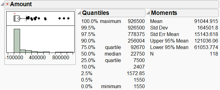
(Notes: The center of the diamond is the mean. We will discuss this in a few moments. The red bracket
at the top, which we won’t discuss further, denotes the “densest” region of the data.)
The outlier box plot helps us to visually identify potential outliers. The rule of thumb used to distinguish
outliers from non-outliers is this: if the histogram is approximately normal, or bell-shaped, outliers are
those points that extend beyond 1.5 IQRs of the box. The line extending from the right edge of the box,
called a whisker, is roughly 1.5 IQRs in length (we say “roughly”, because it is actually drawn to the
furthest point within that range, so it may not be quite 1.5 IQRs).
Let’s ignore, for sake of illustration, the fact that our data are right skewed. There are 16 points beyond
the whisker, which we will consider to be outliers. In this case, the outliers are those points that are much
larger than the rest.
Having identified several outliers, what should we do about them? Let’s consider removing them from the
analysis. To do so, we will hide and exclude the points (rather than simply deleting them). Hide removes
points from graphs, while Exclude removes them from future calculations.
Exhibit 2 is the new histogram for Amount after excluding and hiding the 16 outliers.
Exhibit 2 Amount after excluding and hiding 16 outliers
(To exclude and hide, draw a box around the points in the
boxplot to select them. Then, select Rows > Hide and
Exclude. Return to Analyze > Distribution and re-generate
the histogram.)
Note that there are now seven (7) new outliers! We might as well get rid of those seven outliers as well.
The result is shown in Exhibit 3.
Exhibit 3 Amount after excluding and hiding a total 23 outliers
OK, so now we have six more outliers. How long can this game go on? You’re welcome to continue
excluding and hiding outliers as you see fit. Or perhaps you’ve gotten the message: discarding outliers
1.5 pt
Expert Answer
WPC 300 : HOA-2 : Case - Medical Malpractice
AUG 2020 UPDATE is now ready see it here
Analysis
We begin by looking at the key variable of interest, the amount of claim payment. Exhibit 1 displays a histogram and summary statistics for Amount.
Exhibit 1 Distribution of Amount 6 pt
(Analyze > Distribution; Select Amount as Y, Columns, and click OK. For a horizontal layout select Stack under the top red triangle.)

From Exhibit 1 we see that the histogram of Amount is skewed right, meaning that ...
Buy This Answer $15
-- OR --
Subscribe $20 / Month