
(Solved): WPC 300 : HOA-2 : [UPDATED] Case - Medical Malpractice : Descriptive Statistics, Graphics, and Exploratory Data Analysis-...
WPC 300 : HOA-2 : Case - Medical Malpractice
AUG 2020 UPDATE is now ready see it here
WPC 300 : HOA-2 [UPDATED]
Medical Malpractice:
Descriptive Statistics, Graphics, and Exploratory Data Analysis
Background
According to a recent study published in the US News and World Report the cost of medical malpractice in the United States is $55.6 billion a year, which is 2.4 percent of annual health-care spending. Another 2011 study published in the New England Journal of Medicine revealed that annually, during the period
1991 to 2005, 7.4% of all physicians licensed in the US had a malpractice claim. These staggering numbers not only contribute to the high cost of health care, but the size of successful malpractice claims also contributes to high premiums for medical malpractice insurance.
An insurance company wants to develop a better understanding of its claims paid out for medical malpractice lawsuits. Its records show claim payment amounts, as well as information about the presiding physician and the claimant for a number of recently adjudicated or settled lawsuits.
The Task
Using descriptive statistics and graphical displays, explore claim payment amounts, and identify factors that appear to influence the amount of the payment.
The Data MedicalMalpractice.jmp
The data set contains information about the last 118 claim payments made, covering a six month period.
The eight variables in the data table are described below:
Amount Amount of the claim payment in dollars
Severity The severity rating of damage to the patient, from 1 (emotional trauma) to 9 (death)
Age Age of the claimant in years
Private Attorney Whether the claimant was represented by a private attorney
Marital Status Marital status of the claimant
Specialty Specialty of the physician involved in the lawsuit
Insurance Type of medical insurance carried by the patient
Gender Patient Gender
The variables are coded in JMP with a Continuous, Ordinal or Nominal modeling type. This coding helps to make sure that JMP performs the correct analysis and produces appropriate graphs.
A first step in any analysis is to ensure that your variables have the correct Modeling Type:
- Continuous variables, like Amount, have numeric values (e.g.; 2, 5, 3.35, 159.667,…).
- Ordinal variables, such as Severity, have either numeric or character values which represent ordered categories (e.g.; small, medium and large; 1-9 severity rating scales,…).
- Nominal variables, like Gender, can also have either numeric or character values, and represent unordered categories or labels (e.g.; the names of states, colors of M&Ms, machine numbers,…).
Analysis
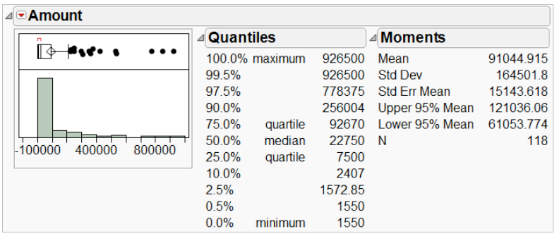
We begin by looking at the key variable of interest, the amount of claim payment. Exhibit 1 displays a histogram and summary statistics for Amount.
Exhibit 1 Distribution of Amount
(Analyze > Distribution; Select Amount as Y, Columns, and click OK. For a horizontal layout select Stack under the top red triangle.)
From Exhibit 1 we see that the histogram of Amount is skewed right, meaning that there is a long tail, with several very high payments. The mean (average) payment is _______ while the median (middle) is ___________. When a histogram is right skewed, as is the case here, the mean will exceed the median. This is because the mean is influenced by extreme values – the high payments that we observe in the histogram inflate the mean.
A measure of the spread of the data is the standard deviation (StdDev in Exhibit 1). The higher the standard deviation, the larger the spread, or variation, in the data. When the data are skewed, the standard deviation, like the mean, will be inflated.
Other useful summary statistics are the quartiles. The first quartile (next to 25.0% in Exhibit 1) is ________ and the third quartile (next to 75.0%) is __________. The interquartile range, defined as Q3 – Q1, is a measure of the amount of spread or variability in the middle 50% of the data. This value is
displayed graphically in the outlier box plot (above the histogram). A larger version of this plot is displayed below.
The left edge of the box is the first quartile, the center line is the median or second quartile, and the right edge of the box is the third quartile. Hence, the width of the box is the interquartile range, or IQR.
(Notes: The center of the diamond is the mean. We will discuss this in a few moments. The red bracket at the top, which we won’t discuss further, denotes the “densest” region of the data.)
The outlier box plot helps us to visually identify potential outliers. The rule of thumb used to distinguish outliers from non-outliers is this: if the histogram is approximately normal, or bell-shaped, outliers are those points that extend beyond 1.5 IQRs of the box. The line extending from the right edge of the box,
called a whisker, is roughly 1.5 IQRs in length (we say “roughly”, because it is actually drawn to the furthest point within that range, so it may not be quite 1.5 IQRs).
Let’s ignore, for sake of illustration, the fact that our data are right skewed. There are 16 points beyond the whisker, which we will consider to be outliers. In this case, the outliers are those points that are much larger than the rest.
Having identified several outliers, what should we do about them? Let’s consider removing them from the analysis. To do so, we will hide and exclude the points (rather than simply deleting them). Hide removes points from graphs, while Exclude removes them from future calculations.
Exhibit 2 is the new histogram for Amount after excluding and hiding the 16 outliers.
Exhibit 2 Amount after excluding and hiding 16 outliers

Note that there are now seven (7) new outliers! We might as well get rid of those seven outliers as well.
The result is shown in Exhibit 3.
Exhibit 3 Amount after excluding and hiding a total 23 outliers

OK, so now we have six more outliers. How long can this game go on? You’re welcome to continue excluding and hiding outliers as you see fit. Or perhaps you’ve gotten the message: discarding outliers from a skewed distribution is an exercise in futility, since observations that didn’t stand out at first will appear to be outliers after excluding the most extreme observations. Removing observations in this situation just forces other observations to take their place.
There’s an even more important reason not to exclude outliers from the analysis. There’s nothing wrong with those “outliers” — they’re just bigger than most of the other payments. By excluding the 23 outliers, we have removed the really high claim payments made by the insurance company. The average calculated on the remaining observations is $28,306, a number less than one-third the original average. Imagine that the company uses the average and range of the truncated data set to forecast future payments. Upper management will be unpleasantly surprised to find many year-end actual payments
greatly exceeding the predicted payments and you, as the firm statistician, may well be out of a job.
In other words, why discard data points just because they’re unusual or inconvenient? There is great danger in the knee-jerk exclusion of outliers. We’ll see some examples in future cases in which excluding outliers might make sense. The message here is to avoid doing so without good reason.
Let’s now turn to other variables in the data set.
First, we make sure none of the observations are hidden or excluded. The distribution of Age is shown in Exhibit 4.
Exhibit 4 Distribution of Age

(Use Rows > Clear Row States to unhide and unexclude.)
The oldest patient in the data set is ________, the youngest a newborn. The average age is ________and the median age is _________ years.
The shape of this histogram is quite different from that of Amount, which was highly skewed right. Age doesn’t appear overly skewed, and the histogram is nearly symmetric. A symmetric distribution looks about the same on the right side as the left.
Now, we’ll examine the outlier box plot of Age. Once again, we’ve reproduced the box plot below. Recall that the peak of the diamond is the position of the mean. This outlier box plot tells us that the mean and median are quite close and, therefore, that the distribution is nearly symmetric. Because no points are shown beyond the whiskers, this outlier box also indicates an absence of potential outliers.
median mean
We will next examine the distribution of Gender. Recall that for Amount and Age, which are continuous
variables, we used histograms and summary statistics to characterize the shape, center and spread of
the distributions. Since Gender is Nominal, we use a bar chart and a frequency distribution (Exhibit 5).
Exhibit 5 Distribution of Gender
(Analyze > Distribution)
From the bar chart and its accompanying frequency table we see that _________ of the 118 patients
in this sample are female and __________% are male.
Along with bar charts, Pareto plots and pie charts can be used to display information about nominal
(categorical) variables. Exhibit 6 shows a Pareto plot and pie chart for Insurance type.
1.5 pt
1 pt
7
Dynamic plot-linking
If we select observations in a data table, those observations are also selected in all open graphs.
Likewise, if we select observations in a plot, those observations are also selected in other plots and in the
data table.
This dynamic linking can help us explore how different variables relate to one another. Consider the
histogram of Amount and the bar graph of Gender in Exhibit 7 below. By clicking on the bar for
Females, those same observations are highlighted in the histogram of Amount. Click on the bar for
Males, and the observations for males are selected.
Exhibit 6 Distributions of Amount and Gender, Females
Are males and females distributed in a similar manner across the payment amounts? If so, we would
conclude that Amount and Gender are not related, since males and females received roughly the same
number of low, medium and high payment amounts. We explore this question further using the Data
Filter.
2 pt
8
The Data Filter
The Data Filter provides another method for exploring the distribution of one variable across the levels of
another variable. For example, we can use the Data Filter to show the distribution of Amount for each
Gender. In Exhibit 8 we see the Data Filter and results for females only.
Exhibit 7 Amount with Data Filter, Gender, Females
(Rows > Data Filter; select Gender and click Add. Then, select Female to select the values for the females in the histogram. To
update the Distribution output with the Amount values for females only, check the Include box in the data filter. Then, in the
Distribution window select Automatic Recalc under the top red triangle.)
When we select males in the Data Filter, the Distribution window will show only the amounts paid for
males.
Exhibit 8 Amount with Data Filter, Gender, Males
Compare the output for females and males. The histograms for females and males look similar, with the
possible exception of a few more extreme points for males (note that the scales are different). What
about the summary statistics? The mean for males ( __________ ) is much higher than for females
( ________ ). But, recall that Amount is highly skewed, and extreme observations will have a large
influence on the mean.
1.5 pt
1.5 pt
1 pt
9
Exhibit 9 Quantiles of Amount for Females (left) and Males (right)
From this analysis, there does not seem to be a notable difference in the distribution of Amount for males
and females. Both distributions are right skewed, and the bulk of claim payments fall below $400,000 for
both genders. We will examine this again in another case that uses more formal statistical methods, and
will revisit this analysis in an exercise.
Side-by-Side (Comparative) Box Plots
Let’s now consider other variables. We’ll investigate whether payment amounts are related to whether or
not a private attorney represented the claimant. In a complete analysis, we would start by exploring
distributions of all variables. We’ll jump ahead and introduce a third method for comparing distributions:
side-by-side box plots, also known as comparative box plots.
We will use box plots to explore the relationship between Private Attorney and Amount. In Exhibit 10,
we show box plots and quantiles. Note that 40 cases did not use a private attorney (Not Private), and 78
did use a private attorney (Private).
Exhibit 10 Fit Y by X, Amount and Private Attorney
(Analyze > Fit Y by X; use Private Attorney
as X, Factor and Amount as Y, Response.
Then, select Quantiles under the top red
triangle).
1.5 pt
1.5 pt
10
Both the box plots and the quantiles indicate that the amount of the claim payment had a lot to do with
whether a private attorney was used. This makes a lot of sense. Would you rather have your own (paid!)
attorney, or take your chances?
The Graph Builder
The final method we’ll introduce is a graphing platform unique to JMP, the Graph Builder. In this platform
you can drag and drop variables to dynamically explore relationships between two or more variables.
Thus far, we’ve investigated the relationship between Gender and Amount, and between Private
Attorney and Amount. But, do we draw different conclusions if we look at all three variables at once?
In Exhibit 11, we see the relationship between Gender and Amount. The data are broken down by
Private Attorney.
Exhibit 11 Graph Builder, Amount vs. Gender by Private Attorney
(Graph > Graph Builder; Drag and drop Amount in Y, Gender in X, and Private Attorney in Group X. Click
on the box plot icon at the top. Or, right-click in the graph and select Points > Change to > Box Plot.)
Earlier, we concluded that there didn’t appear to be a relationship between Gender and Amount. And,
we found that the amount paid was related to whether a private attorney was used.
When we include both variables in the same analysis, do we draw the same conclusions? It appears that
the relationship between Private Attorney and Amount is consistent for females and males. In other
words, it doesn’t matter if someone was female or male, if a private attorney was used the payout was
generally much higher.
A word of caution: oftentimes, the relationship between one variable and another depends upon a third
variable. For this reason, it is important to use tools like Graph Builder, in conjunction with the graphical
tools introduced earlier, to explore more than two variables at a time.
1.5 pt
11
Summary
Statistical Insights
• In this case we provided an introduction to descriptive statistics and graphs.
• For a skewed distribution, the mean and the median will be very different. The median is more
representative of the center of the data for skewed distributions.
• For a symmetric distribution, the mean and the median will be similar.
• The 1.5 x IQR outlier rule says that points beyond 1.5 interquartile ranges of the outlier box are
outliers (if the distribution is roughly normal).
• Don’t automatically exclude outliers. There should be a very good reason to eliminate data!
Managerial Implications
The skills learned in this case can be used to prepare all sorts of summary statistics and graphs for
the variables in the data set. For example, the average level of claim payments is ___________
although there were a few large payments made, one as big as __________. About ________ of
the sample is male patients.
Thus far, we’ve learned that we should expect to pay higher claims when a private attorney
represents the claimant. Further analysis may lead insights that will guide future business decisions.
JMP Features and Hints
• Before you begin any statistical analysis in JMP, check that each variable in the data set has the
appropriate modeling type. By default, all numeric columns are set to continuous and all
character columns are set to nominal. Discrete variables may need to be changed to nominal or
ordinal modeling types.
• JMP will produce graphs and analyses based on your chosen modeling types. JMP will go down
a different path if you fail to set the appropriate modeling type.
• Don’t be quick to delete rows from the data set. It’s easier to temporarily exclude or hide them.
In JMP, to exclude an observation means to prevent it from being used in subsequent
calculations such as those for the mean. To hide a row means to remove it from graphs. You
can exclude and not hide (and vice versa).
• You now know how to use JMP to create: histograms, bar graphs, dynamically-linked plots, sideby-
side box plots, and graphs involving more than two variables at a time.
Expert Answer
WPC 300 : HOA-2 : Case - Medical Malpractice
AUG 2020 UPDATE is now ready see it here
Buy This Answer $15
-- OR --
Subscribe $20 / Month