
(Solved): WPC 300 Assignment 5...

WPC 300 (Hybrid Course)
Assignment-5
Maximum points: 25
Student Name: _[Mary Alfansha ]___________________ Class Day & Time:__[Monday & 9.15 AM]_
Assignment instruction:
You must install JMP pro on your computer before attempting this assignment. You must use the data file: MedicalMalpractice.JMP. Read the case very carefully and answer the questions (fill in the blanks) when necessary. In addition, you must reproduce all the exhibits (via screenshots of your work) by following the instructions provided in the case.
Exhibit 1 [1.5 pt]
- The mean (average) payment is _______ while the median (middle) is ___________. When a histogram is right skewed, as is the case here, the mean will exceed the median. [1 pt]
- Other useful summary statistics are the quartiles. The first quartile (next to 25.0% in Exhibit 1) is ________ and the third quartile (next to 75.0%) is __________. [2 pts]
Exhibit 2 [1.5 pt]
Exhibit 3 [1.5 pt]
Exhibit 4 [1.5 pt]
- The oldest patient in the data set is ________, the youngest a newborn. The average age is ________and the median age is _________ years. [1 pt]
Exhibit 5 [1.5 pt]
- From the bar chart and its accompanying frequency table, we see that _________ of the 118 patients in this sample are female and __________% are male. [1 pt]
Exhibit 6 [2 pt]
Exhibit 7 [1.5 pt]
Exhibit 8 [1.5 pt]
- The mean for males ( __________ ) is much higher than for females ( ________ ). [1 pt]
Exhibit 9 [1.5 pt]
Exhibit 10 [1.5 pt]
Exhibit 11 [1.5 pt]
- For example, the average level of claim payments is ___________ although there were a few large payments made, one as big as __________. About ________ of the sample is male patients. [2 pt]
Expert Answer
Analysis
We begin by looking at the key variable of interest, the amount of claim payment. Exhibit 1 displays a histogram and summary statistics for Amount.
Exhibit 1 Distribution of Amount 1.5 pt
(Analyze > Distribution; Select Amount as Y, Columns, and click OK. For a horizontal layout select Stack under the top red triangle.)
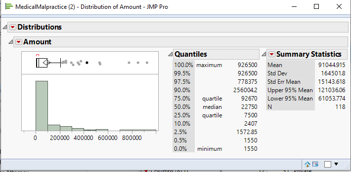
From Exhibit 1 we see that the histogram of Amount is skewed right, meaning that there is a long tail, with several very high payments. The mean (average) payment is 91045 while the median (middle) is
22750. When a histogram is right skewed, as is the case here, the mean will exceed the median. This is because the mean is influenced by extreme values – the high payments that we observe in the histogram inflate the mean.
A measure of the spread of the data is the standard deviation (StdDev in Exhibit 1). The higher the standard deviation, the larger the spread, or variation, in the data. When the data are skewed, the standard deviation, like the mean, will be inflated.
Other useful summary statistics are the quartiles. The first quartile (next to 25.0% in Exhibit 1) is
7500and the third quartile (next to 75.0%) is 92670. The interquartile range, defined as Q3 – Q1, is a measure of the amount of spread or variability in the middle 50% of the data. This value is displayed graphically in the outlier box plot (above the histogram). A larger version of this plot is displayed below.
Buy This Answer $15
-- OR --
Subscribe $20 / Month