(Solved): CIS300: Quiz | Module 4 : Score for this quiz: 100 out of 100...
CIS 300
Quiz | Module 4
Score for this quiz: 100 out of 100
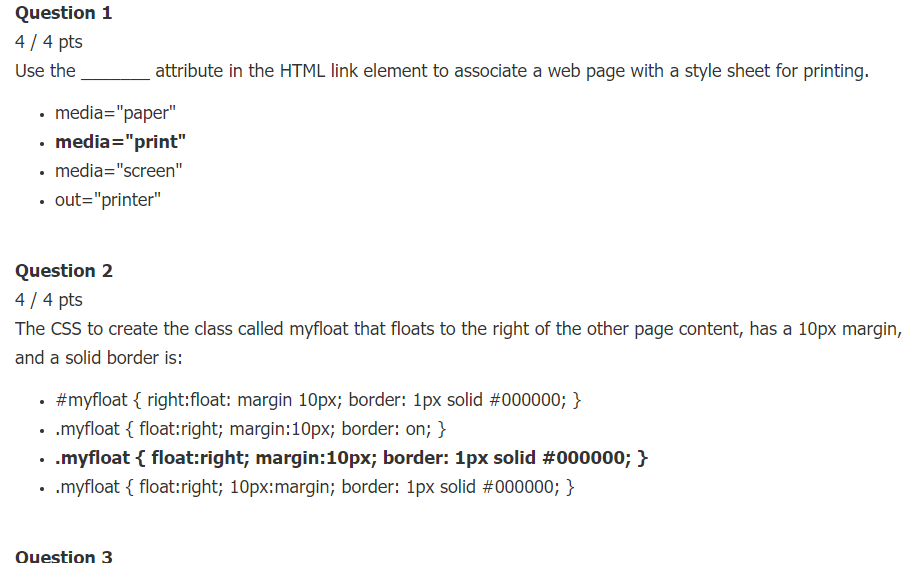
Question 1
4 / 4 pts
Use the _______ attribute in the HTML link element to associate a web page with a style sheet for printing.
- media="paper"
- media="print"
- media="screen"
- out="printer"
Question 2
4 / 4 pts
The CSS to create the class called myfloat that floats to the right of the other page content, has a 10px margin, and a solid border is:
- #myfloat { right:float: margin 10px; border: 1px solid #000000; }
- .myfloat { float:right; margin:10px; border: on; }
- .myfloat { float:right; margin:10px; border: 1px solid #000000; }
- .myfloat { float:right; 10px:margin; border: 1px solid #000000; }
Question 3
4 / 4 pts
What is the term used to describe image file that contains multiple small graphics?
- viewport
- image link
- thumbnail image
- sprite
Question 4
4 / 4 pts
Use the _______ or _______ property to clear a float.
- float or clear
- clear or overflow
- overflow or float
- position or clear
Question 5
4 / 4 pts
Choose the example below of a descendant selector that configures the anchor tags within the element assigned to the content id.
- a#content
- content#a
- #content a
- .content a
Question 6
4 / 4 pts
_______ will cause an object not to display.
- display: fixed;
- display: block;
- display: 0px;
- display: none;
Question 7
4 / 4 pts
Use _______ positioning to slightly change the location of an element in relation to where it would otherwise appear when rendered by a browser.
- static
- absolute
- fixed
- relative
Question 8
4 / 4 pts
The _______ property configures the stacking order of a positioned element on a web page.
- z-index
- stacking
- display
- stack
Question 9
4 / 4 pts
Use _______ positioning to precisely configure the location of an element outside of normal flow.
- fixed
- relative
- absolute
- static
Question 10
4 / 4 pts
If an element is configured with _______ the other content on the page will appear to its left.
- position: relative;
- float :left;
- position: left;
- float: right;
Question 11
4 / 4 pts
Select the example below that could be used to clear a right float.
- right: clear;
- clear: right;
- overflow: right;
- clear: left;
Question 12
4 / 4 pts
The _______ pseudo-class configures the styles that will apply for a hyperlink that has not been visited by the user.
- :unvisited
- :visited
- :link
- :new
Question 13
4 / 4 pts
The ______ property configures a grid container.
- grid
- flex
- container
- order
Question 14
4 / 4 pts
The purpose of the ______ element is to provide a method for a browser to display different images depending on specific criteria indicated by the web developer.
- target
- sizes
- media
- picture
Question 15
4 / 4 pts
When using flexbox layout, the main axis is the
- direction of the wrap
- beginning of the flex container
- direction of the flow
- height of the flex container
Question 16
4 / 4 pts
Use the ______ value for the CSS display property to configure an element to not display.
- block
- none
- 0
- hide
Question 17
4 / 4 pts
When using flexbox layout, setting justify-content: space-between; will configure the following:
- Flex items begin at main start and end at main end with equal empty space between flex items.
- Flex items begin at main start with no space between them.
- Flex items are evenly distributed in the flex container with space before the first flex item and after the last flex item.
- Flex items are centered with equal empty space between.
Question 18
4 / 4 pts
When configuring flexbox or grid layout, the ______ property can be used to change the sequence of the flex items or grid item on the page.
- fr
- skip
- order
- gap
Question 19
4 / 4 pts
Configure a ______ property on a grid item to configure the area in rows that is reserved for the item on the grid.
- display
- grid-gap
- grid-template-rows
- grid-rows
Question 20
4 / 4 pts
The ______ meta tag configures scale and dimension on mobile web page display.
- fragment identifier
- flexible
- viewport
- media query
Question 21
4 / 4 pts
CSS Flexible Box Layout is best suited for:
- floating layouts
- flexible one-dimensional layouts
- flexible two-dimensional layouts
- changing the stacking order of elements
Question 22
4 / 4 pts
A ______ determines the capability of the mobile device, such as screen resolution, and directs browsers to CSS.
- flexible image
- feature query
- viewport
- media query
Question 23
4 / 4 pts
The purpose of the imagd element’s ______ attribute is to provide a method for a browser to display different images depending on specific criteria indicated by the web developer.
- sizes
- media
- srcset
- picture
Question 24
4 / 4 pts
Use the expression ______ in a media query to target devices with screens up to 480 pixels in width.
- (width: 480px)
- (size: 480px;)
- (max-width: 480px)
- (min-width: 480px;)
Question 25
4 / 4 pts
A hyperlink with the ______ scheme may cause a web browser on a mobile device to initiate a phone call.
- sms:
- mobile:
- tel:
- phone:
Expert Answer

Buy This Answer $15
-- OR --
Subscribe $20 / Month
